Portal and Treasure Chest Effects


This week I worked on adding effects to the exit portal and the treasure chests.

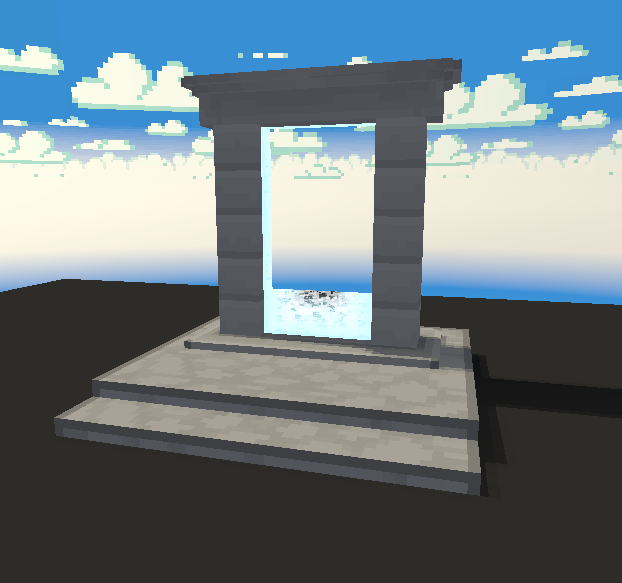
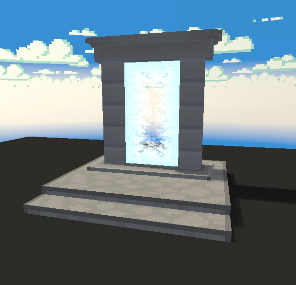
The first thing I worked on was the gateway portal effect.

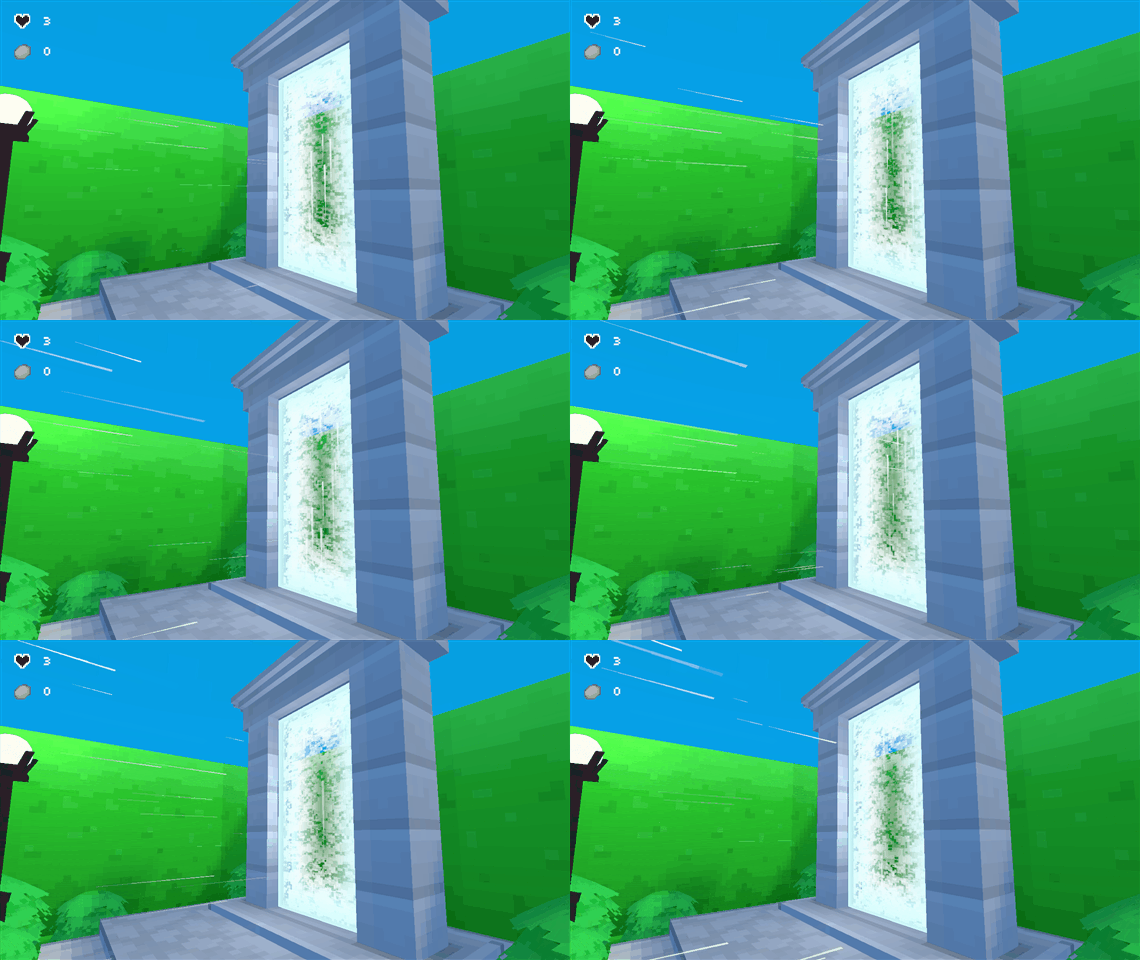
The exit portal. It looks a lot faster here then it actually is.

The effect uses a combination of scrolling textures and a particle effect. I also added normal map distortion to the shader to manipulate the UV position to create a noise-y scattered effect.

I wanted to make it obvious it was an exit, fading the middle of the portal to make it look like it was passable despite its glow. I also made the particles move towards the portal to help create a sense of motion towards it.

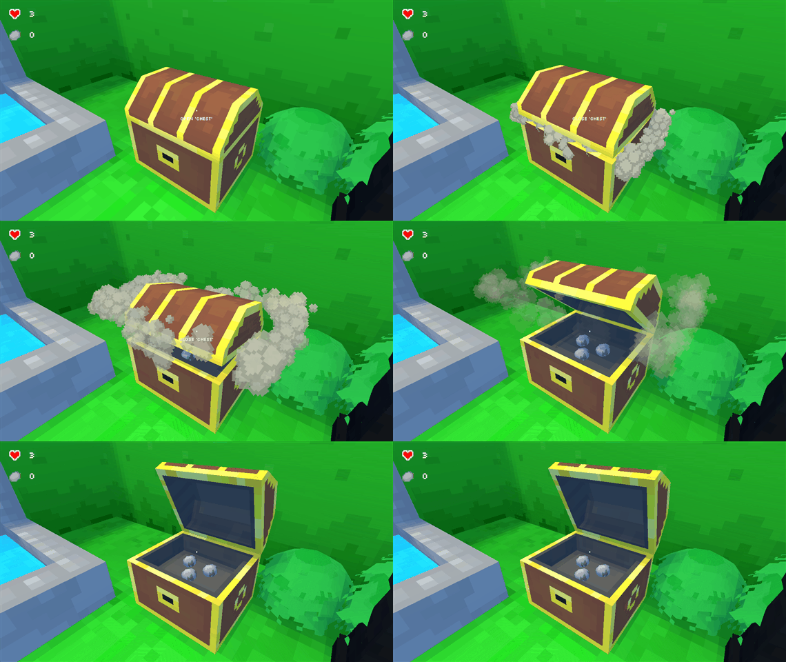
Next I worked on the treasure chests.

Looks like it hasn’t been opened for some time.

I wanted to improve the feeling of opening the chest, adding a little anticipation to the animation and causing dust particles to burst out the first time you open them.


I had to update my SRP implementation to address some issues with rendering order. I was running into issues with the sky rendering over transparent objects in the scene.

The sky clipping out the portal effect.

Conceptually the solution was simple, render the background in its own pass, and render everything else on top. But it took a little while to understand what was going on and how to render everything in the correct order in SRP.

The above is a code snippet of the rendering order. “DrawVisibleOpaque” renders all objects that have no transparency. This also optimizes the background rendering, filling in areas the background won’t have to draw in.

“DrawBackground” renders all the objects that compose the background. It also renders its own transparent objects to keep the background elements together.

And then lastly, there’s “DrawVisibleTransparent”, which renders all other transparent objects on top of the opaque and background result, to create the final image.

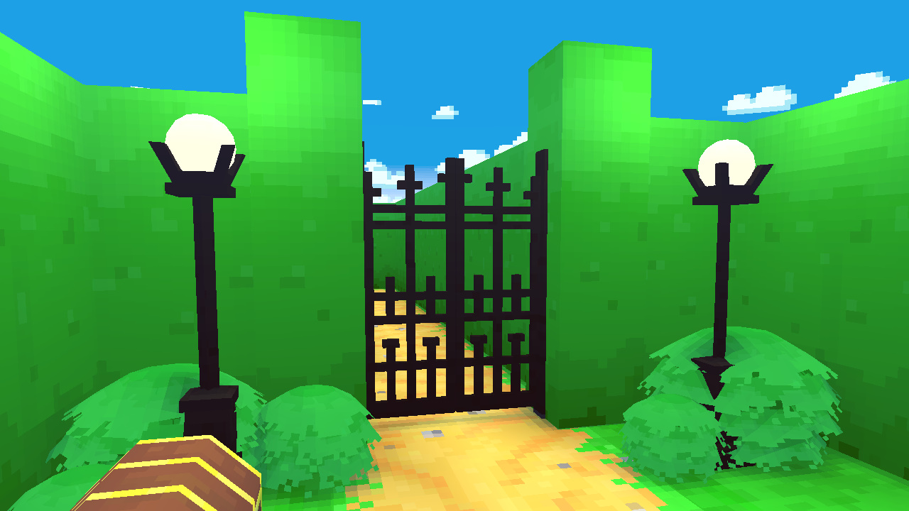
The final image with the portal effect rendering correctly against the sky.

In the next article, I’ll be writing about culling optimization.

Water and Sky Effects


This past week I’ve been working on adding effects to the maze while continuing to learn and understand how to work with Unity’s Scriptable Rendering Pipeline (SRP).

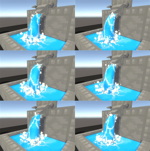
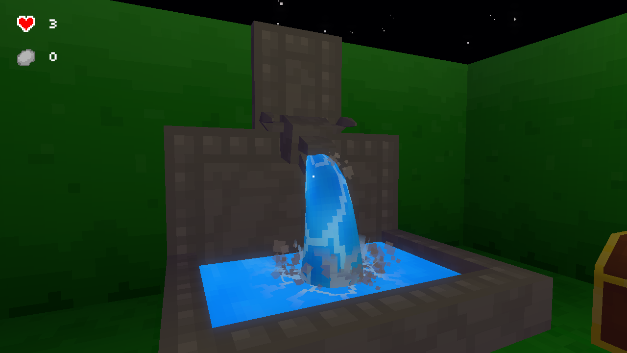
The first effect I added was running water to the fountain at the start of the maze.

I used a common shader effect, known as scrolling textures, or scrolling UVs, to simulate flowing water. The effect is simple, offsetting the UV coordinates of the texture by a given speed and time to give the texture the appearance of water flowing.

Multiple scrolling textures and particles effects make a fairly convincing water fountain.

The water is also partially reflective, which is done using a cube map generated by a reflection probe. The reflection probe dynamically updates every frame, capturing the lighting in the environment, which is then used as the reflection in the shader.

Since the environment’s lighting is dynamic, the updated reflection helps control the water’s brightness and ensures that it looks like it’s part of the same scene.

The left side has a reflection that hasn’t updated. The right side has a reflection which is updating every frame.

Next, I worked on the sky.


The sky in previous images used Unity’s standard procedural skybox which is supported in SRP. I opted to not use it, encouraging me to learn how to set up the rendering pipeline and achieve a similar effect.


The maze with a cloudy horizon.

The clouds are a large horizontal tiling texture, mapped onto multiple mesh cylinders to create a layered effect. Each layer then uses a scrolling texture with different speeds to fake the sense of distance between them.

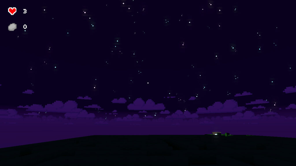
I then started working on adding stars to the sky at night. I wanted to control how they appeared, showing each star one at a time as the sun set.

Initially, I tried using a pixel art texture, but it was too large and distorted, which didn’t look very good. It also didn’t give me much control over the effect, at least not without over-complicating it.

I ended up using a particle system that emitted from a mesh shape that I created in Maya. At each vertex point on that mesh, a particle will spawn, giving me control over the position of each star in the sky.

The pixel-y stars at night, using a texture sheet to create a variety of stars in a particle system.

This is then controlled by the day-night cycle, telling the particle system to start emitting the stars just as the sun goes down, and then updating their remaining lifetime to fade them out when the sun is about to come up.

The sun sets in the maze and then the stars come out.

Next, I’ll be continuing to work on a few more visual effects.

Maze Gameplay #3 – Objectives


Over the last week, I’ve been working on adding small objectives to make escaping the maze more challenging.

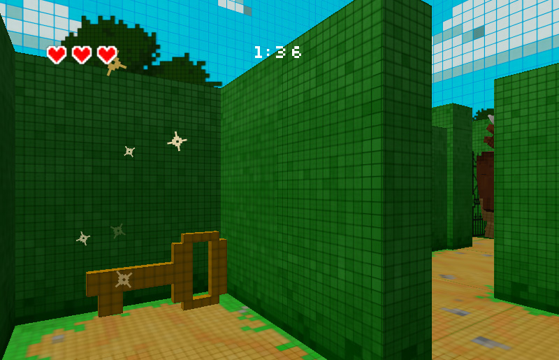
In the original project, to escape the maze, the player had to find a key that opened a gate to a portal which let them escape the maze.

A screenshot of the original Minotaur Maze project, with the key near the exit and the minotaur hiding in the background.

I wanted to do one better, initially coming up with a list of ideas that I thought would be fun. Though, many of them I decided not to do because I felt like they weren’t in the spirit of the game. With some requiring gameplay mechanics beyond the scope of the project.

So after talking through some of my ideas with my partner, I decided to stick with the original project’s design. We ended up focusing on smaller ideas around finding the key to open a gate and escape, which kept the project’s scope manageable.

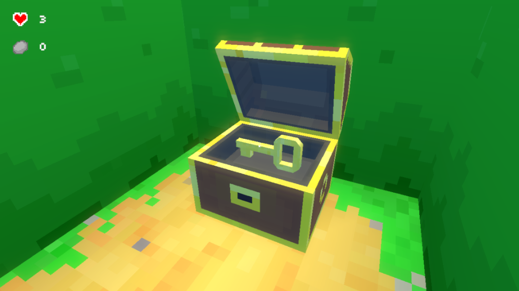
Instead of finding a key, you have to find chests. One chest will have a key in it, while the other chests will have rocks. The key opens the gate to the exit, and the rocks can be used to defend yourself against the minotaur by throwing them at its head to stun it.

The key chest, including some new HUD elements to track health and rocks collected.

Since the maze is procedurally generated, the chests are placed at dead-ends that are in a certain range away from the player. This is to keep them far enough away so they don’t spawn too close to the start, but not so far that they’ll spawn close to the exit too.

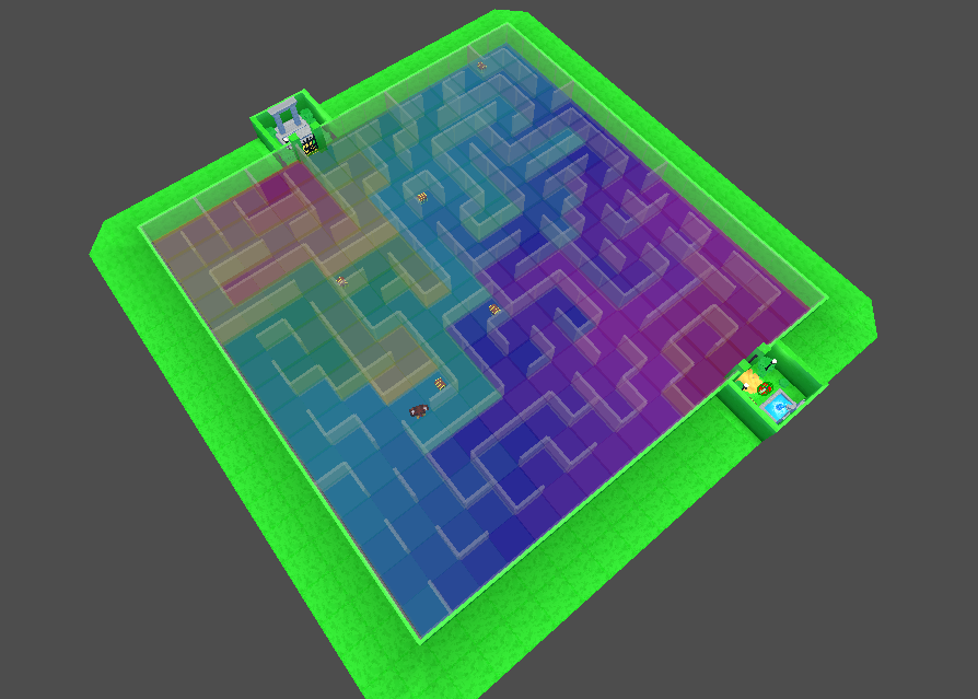
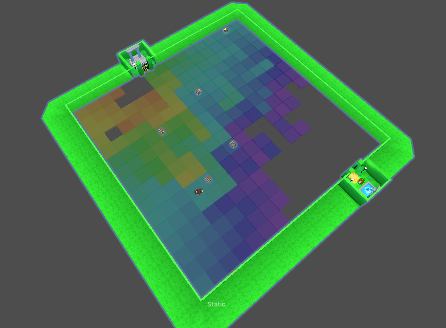
The distance field used to determine chest placement. Purple-blues indicate the closest distance to the start, while yellow-reds indicate the distance farthest from it.
The selected range to place chests with out them being too close to the starting area.

With procedural generation, there is always a chance that there may not be any dead-ends in the selected range. If that happens, the code falls back to selecting a random dead-end. This is just to ensure that all generated mazes are playable and completable.

Once the player finds the key chest, they can open the gate at the exit, escaping the maze and the minotaur.

Next, I’ll be moving onto visual improvements, focusing on the art and adding some visual effects.

Maze Gameplay #2 – The Minotaur


Continuing from my last post, I added the minotaur to the maze, focusing on rebuilding its AI and improving its behavior from the original project.

The original AI code was made using a state machine. It got the job done, but as the requirements grew, so did the number of states and their complexity.

For this project, I’m using Behavior Trees instead to drive the Minotaur’s actions and reduce the amount of complexity.

The behavior tree that is driving the minotaur (WIP). It reads left to right, with nodes to the left taking priority if conditions are met.

I wanted to keep it simple, sticking to typical indie horror monster intelligence.

The minotaur will roam around the maze, moving from one dead-end to another, endlessly searching. When it sees the player, it will start chasing them, trying to hit them. If the player is unlucky, they die.

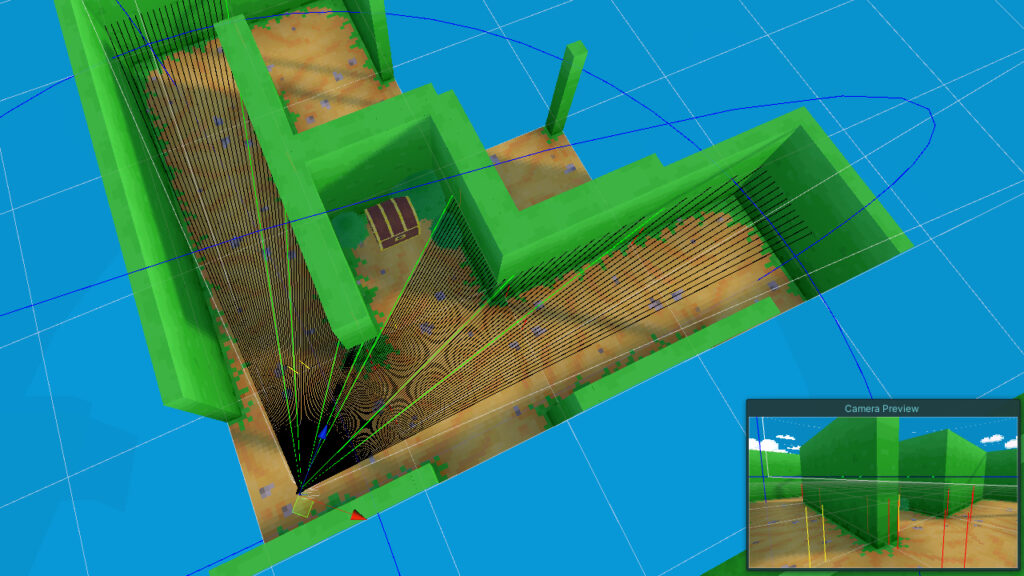
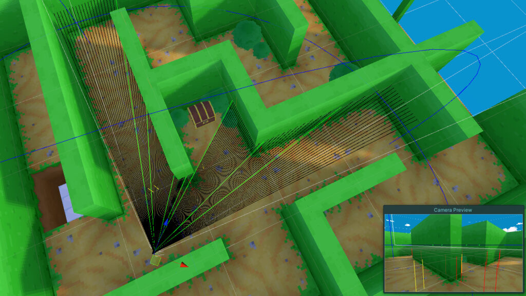
A set of sensors on the minotaur, each with different sensitivity, help detect the player and allow the behavior tree to react and make decisions. If the Minotaur sees the player, it will store that information so that the behavior tree can react. If the minotaur losses sight of the player, that information is updated so that the minotaur can decide what to do next.

The minotaur also has the ability to jump over pits. This is done using customized Off Mesh Links with Unity’s Navigation Mesh to help connect the gaps. Without them, the minotaur would fail to find a path around the maze.

The minotaur can jump pits. Remember that.

The minotaur is not smart, but it’s menacing enough that when you run into it, you’ll want to change directions.

The minotaur has appeared, it's time to run in the other direction.
Time to run away.

Since the major threat in this maze is the Minotaur, I wanted to make sure the player always knows it.

In the original project, there were only loud stomping footsteps that could be heard to emphasize the minotaur’s presence. It helped, but it wasn’t enough, especially if it was played without sound.

To make improvements, I added a camera shake to help communicate visually when the Minotaur’s nearby. Now when it’s near the player or chasing, the screen will shake, increasing in intensity as it gets closer.

Stomp, stomp, stomp!

The player isn’t completely defenseless. They can find rocks that they can use to throw at the minotaur’s head to temporarily stun him, creating an opportunity for the player to run away.

The rocks can also help keep track of paths that they may suspect to loop around. So it can be a useful tool or a defensive weapon.

But how you get these rocks I’ll write about in the next article, “Objectives”.